Burger King, fast-food restaurant chain, announces rebrand, change logo, menu, food package, advertisement, store design Employee uniform Including an entirely new image on social media Which is the first change in 20 years
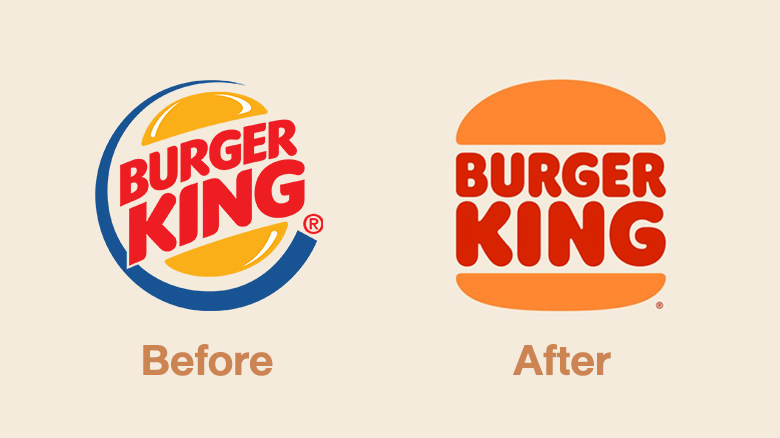
The new Burger King logo uses a minimalist design, leaving only two main colors. The new 2021 logo is a reuse of the old logo used between 1969 and 1999. By cutting out the blue that surrounds the word Burger King
“Design is one of the most important communication tools. To show who we are and what we value It also plays an important role in building appetite. And create the highest experience for our customers ” Rafael Ebri, Head of Design of Restaurant Brands International Burger King’s parent company
Photo courtesy of Burger King
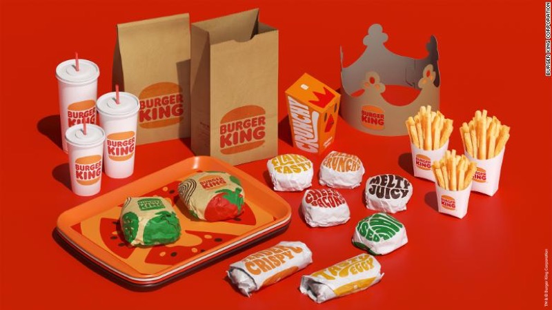
It also changed the staff uniform. And new food packaging The uniforms are modern and bold colors. As for the packaging, in addition to highlighting the new logo It also added descriptions of ‘crispy’ and ‘delicious’.
Photo courtesy of Burger King
Customers all over the world will immediately begin to see their image through advertisements and packaging. But it will take years to come together to renovate 19,000 restaurants around the world.
We use cookies on our website to give you the most relevant experience by remembering your preferences and repeat visits. By clicking “Accept”, you consent to the use of ALL the cookies.
This website uses cookies to improve your experience while you navigate through the website. Out of these, the cookies that are categorized as necessary are stored on your browser as they are essential for the working of basic functionalities of the website. We also use third-party cookies that help us analyze and understand how you use this website. These cookies will be stored in your browser only with your consent. You also have the option to opt-out of these cookies. But opting out of some of these cookies may affect your browsing experience.
Necessary cookies are absolutely essential for the website to function properly. This category only includes cookies that ensures basic functionalities and security features of the website. These cookies do not store any personal information.
Any cookies that may not be particularly necessary for the website to function and is used specifically to collect user personal data via analytics, ads, other embedded contents are termed as non-necessary cookies. It is mandatory to procure user consent prior to running these cookies on your website.


